When it comes to website design what’s so important to website design that without it a website could never truly be called complete? You might’ve guessed domain, links, or even images and those are all right answers but the answer that I was looking for was color palette. Color palettes are needed for websites as they help them look more visually appealing and credible. In my blog, I will discuss all the psychological benefits of using a brown color palette and ways to implement brown color palettes on website designs.
The Psychology Behind
What is the psychology behind the color brown? Well, color-psychology says that the color brown is often associated with many things such as reliability, calmness, stability, and earthiness. Brown is also seen as a color of authority and trust, making it a great choice for websites. The color brown on websites can also help users invoke feelings of comfort and dependability furthermore, brown is one of the best colors you can use for websites as it’s not too overwhelming or flashy.
Brands that use brown well
Louis Vuitton
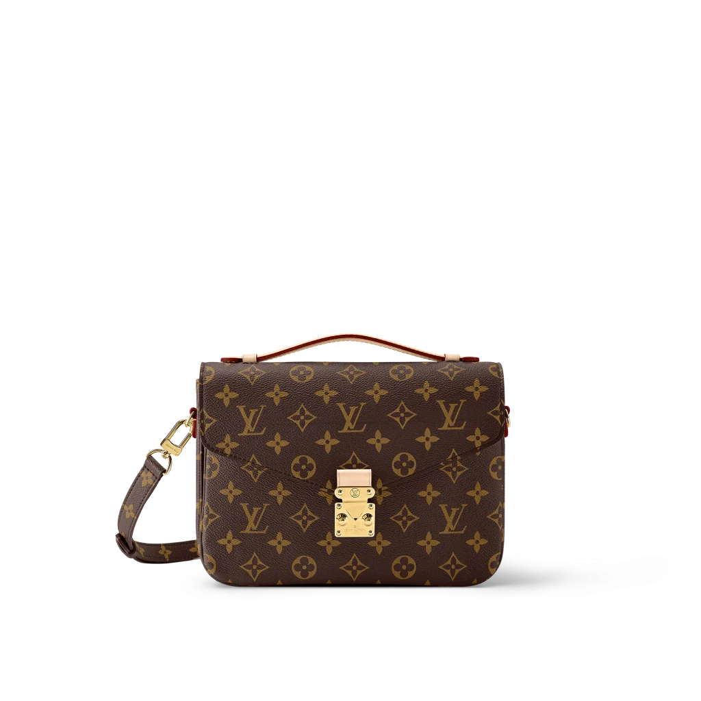
The luxury brand Louis Vuitton uses the color brown in its brand and website exceptionally well! They use the colors brown and yellow to create a warm and shopistacted looking design. Psychology says that the colors the brand uses evoke feelings of warmth and are closer to its people.
M&M’s
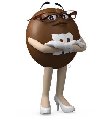
The popular food brand M&M’s uses the colors brown and white to display their brands, I think the way they use is perfect as the white creates attraction and it also blends in with the brown. Psychology says that the color white shows purity and perfection which can help people feel more trusted in M&M’s.
UPS
The transportation company UPS uses the colors yellow and brown in their company very well! The reason I’m saying this is because they have the perfect ratio of brown to yellow in their brand/website design. That perfect ratio helps the website not only look fresh but also credible as its design looks good.
Brown Color Palettes
#1 Baby Brown
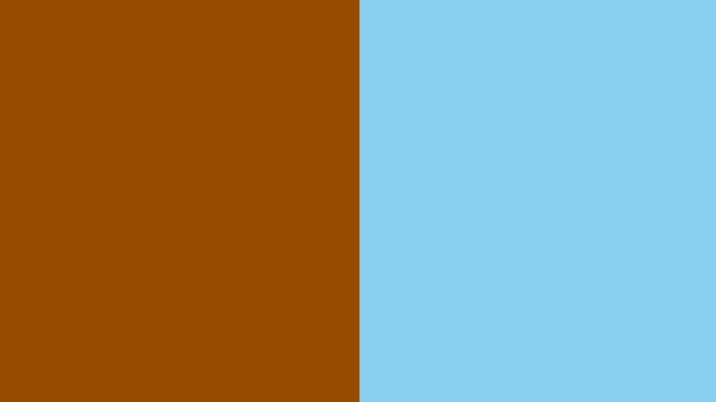
Baby blue (#89CFF0) and brown (#964B00) make an amazing combination of simplicity and sophistication. This combination can help websites look welcoming and fresh as psychology states that the color baby blue is known to display airy, playfulness, and freshness
#2 Vibrant Naturistic
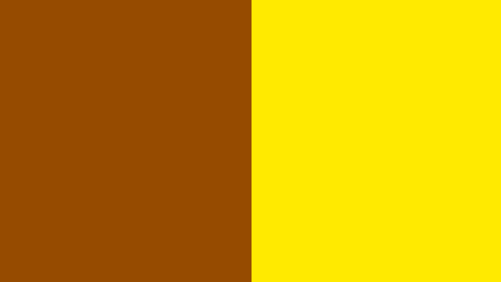
Yellow (#FFEA00) and brown create a wonderful combination that displays trust and joy. This combination can help websites look more likable as the color yellow is known to express joyfulness, happiness, and in general positive energy,
#3 Vintage Sleek

Green (#00A36C) and brown is a combination that helps websites look more professional and sleek. This combination is likely to display a more vintage look as the brown hues with green create an old dark sleek type look.
#4 Double Trouble

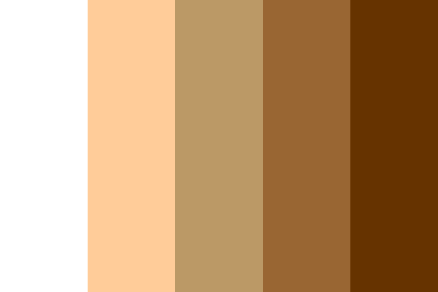
Brown (#654321) with a lighter brown is a combination that can help websites look opulent. This combination also helps websites look super simple and also ultramodern. The reason I recommend this color scheme specifically is because these colors complement each other so well and they help websites feel more comfortable and warm looking.
#5 Chocolate Vanilla

White with brown is one of the best color schemes not just in this blog but as a whole. The reason white and black are such good colors is because they complement each other so well The brown adds a nice contrast to the white, making it feel more inviting and welcoming. Also brown and white are both versatile colors that have been used since the beginning of web design.
#6 Light dark
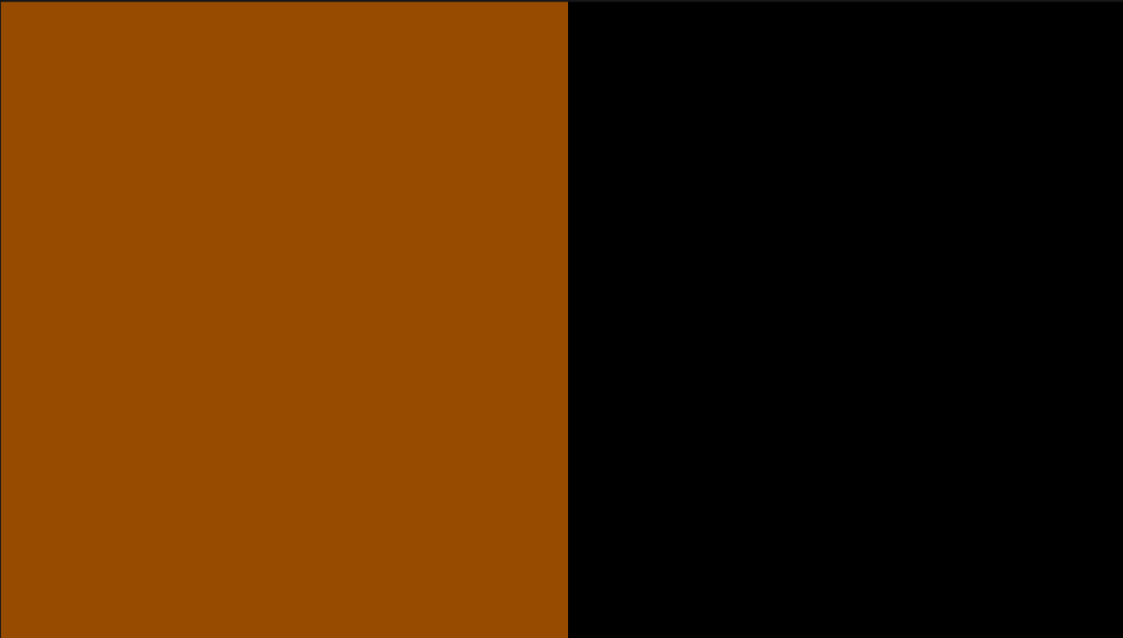
Black and brown just like white and brown is also one of the best color schemes. The reason I believe that this is also one of the best color schemes is because firstly it’s very versatile and it looks good partnered with almost any third color.
#7 Brown Sakura

Pastel pink (#FFD1DC) and brown is a great color palette combination! The reason I believe that is because the color pastel pink helps brown look lighter and it also adds a natural-looking inviting area. The pink can also help attract first sight as it’s a bright color.
#8 Halloween & Fall

Orange (#FFA500) and brown are some of my personal favorites for color palettes! The reason orange and brown are my favorites to have in color palettes is because they both complement other colors so well especially each other. This combination of colors also adds a dark energy theme that looks great on websites especially during fall and or Halloween as that’s when these colors are in their prime.
#9 Brown Lilac

Lilac Purple (#C8A2C8) and brown are a great color palette for websites if applied properly. With lilac purple and brown both being colors that can blend with other colors easily, we need to have one that’s gonna be more dominant, and having purple as that can complement websites great! Just like a lilac imagine the website’s parts as the leaves and the branch.
Conclusion
In conclusion, the meaning behind the color brown is very important to understand for web designers as not only is its meaning versatile but so is it as an actual color. The color brown is often associated with many things such as reliability, calmness, stability, and earthiness it’s also a very versatile color as it’s not too overwhelming or flashy.
